Case study · PriceLabs
A complex pricing tool, simple enough for your pocket
Designing the first PriceLabs mobile app, from scoping to launch and what came after.
Shail Chandel · Product DesignerNov 2025 – Oct 2026
04 · A mobile layer on the design system
Mobile variants on existing components, not a new library
48px buttons & inputs32px chipsAAA primary textAA calendar22 components
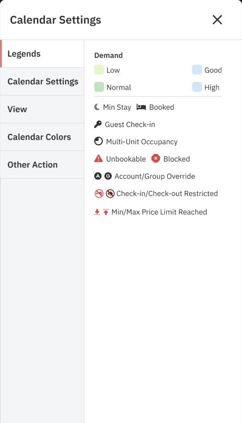
Bottom sheetsSettings one tap away
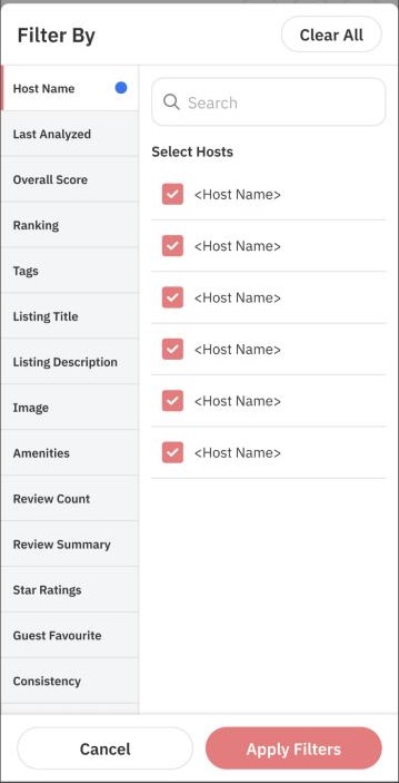
Same pattern, reusedDesktop tabs → filter sheet
PriceLabs mobile app6
05 · Onboarding
A one-way street to the first sync
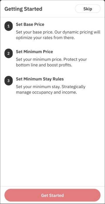
Steps up front3 steps, with a skip
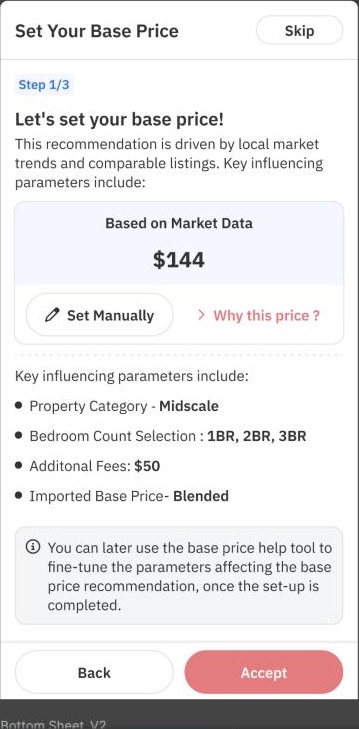
Recommend firstEdit second
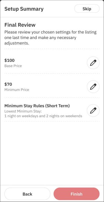
ReviewEvery choice editable
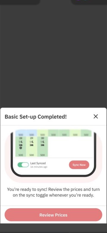
Sync stays offuntil the host reviews
PriceLabs mobile app7
06 · The daily loop
Check, adjust, sync, with your thumb
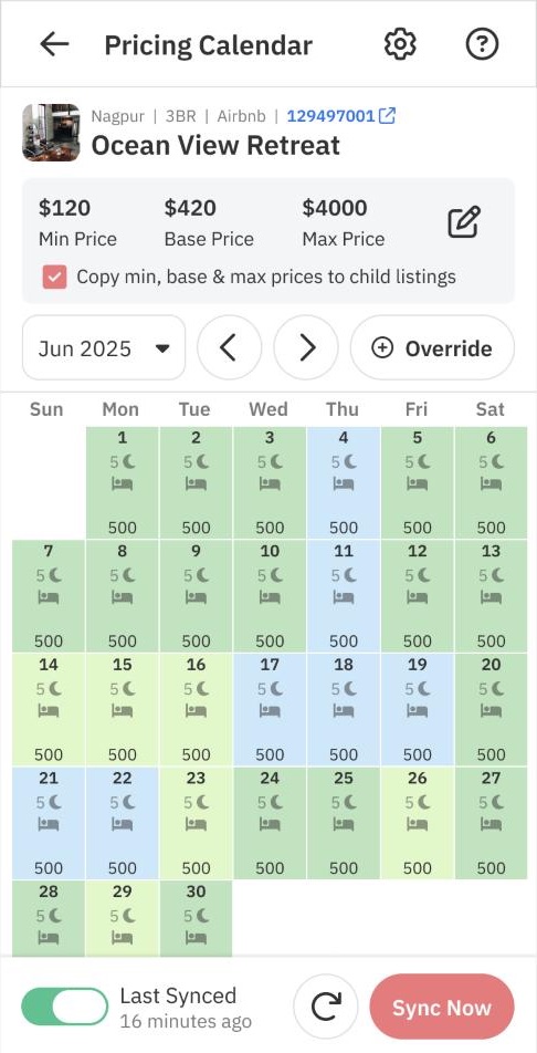
The calendar carries only the essentials. Sync lives in the thumb zone, and overrides were redesigned around the quick 80% case.
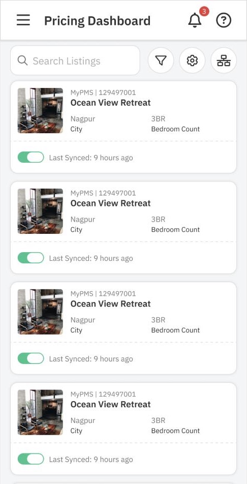
DashboardSync status at a glance
CalendarDemand colours, Sync now
PriceLabs mobile app8